Where to draw the line - vineyard cartography
Everyone loves a wine map - but please be warned, this is not an exciting or colourful article and is only of interest to those nerdy few who make wine maps or wonder what questions need to be asked when they are made. It is particularly interesting for Liz and I as we are currently in the map-making phase of our new rosé guide! Unusually for rosé, we’re going for as much detail as possible - here’s why.
Formerly black-and-white sketches in thick books, wine maps today are brightly colourful, consumer-friendly, and absolutely everywhere. Is this explosion in popularity at the expense of their accuracy and usefulness?
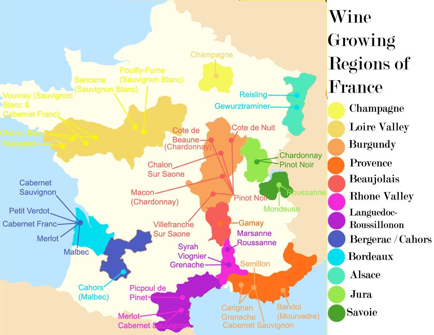 Let’s take a look at exhibit A: a well-meaning map that gives a rough indication of where, in France, very roughly, wine is made. What it lacks in detail, it makes up for in enthusiasm. I won’t even begin to talk about everything it does wrong - keep looking and you will find more.
Most importantly though, it educates and satisfies the curious itch of a budding wine drinker far better than the meticulous detail of, for example, this very pretty map of Volnay (it’s always Burgundy, isn’t it?), whose detailed scale will scare off absolutely everyone but the most devoted. Exhibit B, a very pretty and helpful map on the location within Volnay of its various lieux-dits:
Let’s take a look at exhibit A: a well-meaning map that gives a rough indication of where, in France, very roughly, wine is made. What it lacks in detail, it makes up for in enthusiasm. I won’t even begin to talk about everything it does wrong - keep looking and you will find more.
Most importantly though, it educates and satisfies the curious itch of a budding wine drinker far better than the meticulous detail of, for example, this very pretty map of Volnay (it’s always Burgundy, isn’t it?), whose detailed scale will scare off absolutely everyone but the most devoted. Exhibit B, a very pretty and helpful map on the location within Volnay of its various lieux-dits:
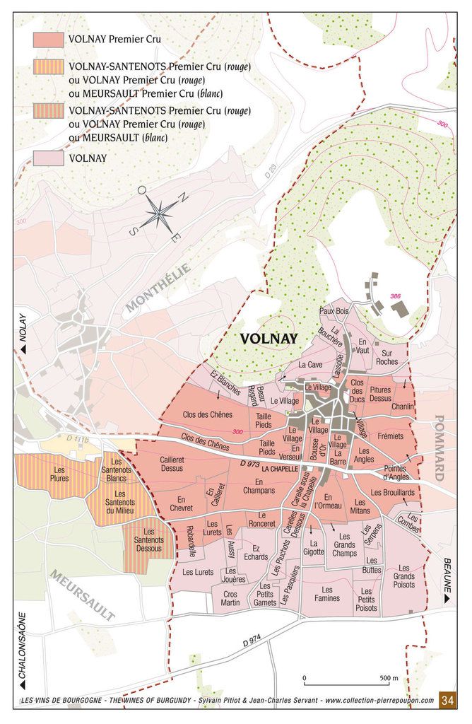 Despite their differences, both maps have the first and foremost purpose of linking a wine with a place. Which does a better job? With the helpful varietal labels of the first map, you could even argue that it does a better job of informing its target audience of information that they will find relevant and interesting.
Indeed, whilst the first map provides information other than place, the Volnay map provides no information other than the snobby “this lieu-dit is here, and this one is there”. It is a graphical depiction of a set of GPS coordinates. Knowledge external to the map is required to interpret it. For its target audience, the information-starved €60+ a bottle Burgundy buyer, it actually provides no meaningful information at all on the contents of the bottle they might be drinking - whereas the cheap and cheerful blobby map actually does a better job of informing consumers of the contents of the cheap and cheerful wine they have bought. To make the most of its scale and potential for detail, it should include further information on slope, vine age, ownership, soil composition, elevation. These should be either on the map itself or in the legend. If they are included in accompanying text, then the map is helpful and illustrative, but it is not neccessarily in and of itself informative.
(I should note here that I did not set out to write this article with the expectation that I would proclaim an awful map the best, and a beautifully designed one to be useless - so let’s get back to the topic at hand)
Despite their differences, both maps have the first and foremost purpose of linking a wine with a place. Which does a better job? With the helpful varietal labels of the first map, you could even argue that it does a better job of informing its target audience of information that they will find relevant and interesting.
Indeed, whilst the first map provides information other than place, the Volnay map provides no information other than the snobby “this lieu-dit is here, and this one is there”. It is a graphical depiction of a set of GPS coordinates. Knowledge external to the map is required to interpret it. For its target audience, the information-starved €60+ a bottle Burgundy buyer, it actually provides no meaningful information at all on the contents of the bottle they might be drinking - whereas the cheap and cheerful blobby map actually does a better job of informing consumers of the contents of the cheap and cheerful wine they have bought. To make the most of its scale and potential for detail, it should include further information on slope, vine age, ownership, soil composition, elevation. These should be either on the map itself or in the legend. If they are included in accompanying text, then the map is helpful and illustrative, but it is not neccessarily in and of itself informative.
(I should note here that I did not set out to write this article with the expectation that I would proclaim an awful map the best, and a beautifully designed one to be useless - so let’s get back to the topic at hand)
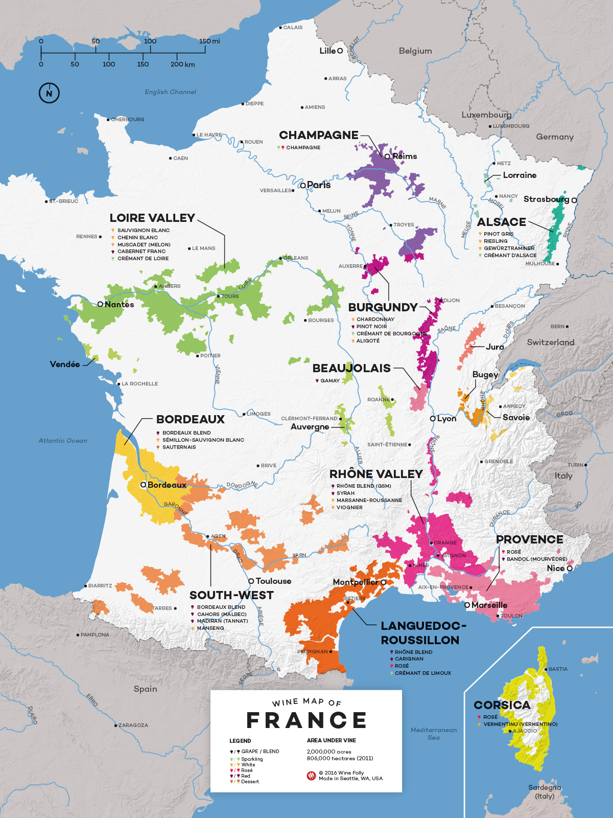 Exhibit C, from WineFolly, is much better than either. The Alps are no longer viticultural, Burgundy is a little smaller, although there is still very little detail - overall, not a bad map at all (even if I have some qualms about the ‘varietalisation’ of every region - an unfortunately necessary evil in the American market I suspect).
One issue, however, remains, and it is especially prevalent in the south. The Corsican coastline appears as an intensive viticultural ribbon - when its area under AOP is less than 1/10th of Burgundy’s. This isn’t an issue of detail (unlike the Volnay/blob duo earlier) - this is one that I think can best be described as an issue of granularity. Is this sloppiness on the part of the mapmaker, or are they innocently repeating mistakes in official governmental maps? Let’s take a look.
A quick zoom-in on Corsica on the INAO’s map (a cut-down but fairly accessible version is available here https://www.geoportail.gouv.fr/donnees/inao-aoc-viticoles-parcellaire) shows two things, one more worrying than the other. Firstly, that WineFolly’s map includes large swathes of Corsica excluded from the INAO’s (IGP maybe?), but secondly - even the INAO’s map includes areas that are definitely not vineyards.
Maybe add that people look at wine maps for different reasons. Wine people like maps. Geology, terroir, climate, distribution of varieties, proximity of one region to another. Why do we look at maps of wine regions?
Exhibit C, from WineFolly, is much better than either. The Alps are no longer viticultural, Burgundy is a little smaller, although there is still very little detail - overall, not a bad map at all (even if I have some qualms about the ‘varietalisation’ of every region - an unfortunately necessary evil in the American market I suspect).
One issue, however, remains, and it is especially prevalent in the south. The Corsican coastline appears as an intensive viticultural ribbon - when its area under AOP is less than 1/10th of Burgundy’s. This isn’t an issue of detail (unlike the Volnay/blob duo earlier) - this is one that I think can best be described as an issue of granularity. Is this sloppiness on the part of the mapmaker, or are they innocently repeating mistakes in official governmental maps? Let’s take a look.
A quick zoom-in on Corsica on the INAO’s map (a cut-down but fairly accessible version is available here https://www.geoportail.gouv.fr/donnees/inao-aoc-viticoles-parcellaire) shows two things, one more worrying than the other. Firstly, that WineFolly’s map includes large swathes of Corsica excluded from the INAO’s (IGP maybe?), but secondly - even the INAO’s map includes areas that are definitely not vineyards.
Maybe add that people look at wine maps for different reasons. Wine people like maps. Geology, terroir, climate, distribution of varieties, proximity of one region to another. Why do we look at maps of wine regions?

 Take this large forest on the eastern plain. Definitely not vineyards, and I don’t think you can cut a clearing, plant Niellucio, and sell AOP Corse wine. So why is it on the INAO map?
At this point, our cartography question becomes a much, much more complicated one of ‘which vineyards can produce AOP wine’ - and we are only interested in representing those vineyards on the map, not including an analysis on why they are included.
At the all-France or all-Corsica level, including forests is a good shortcut to a decent understanding of the situation on the ground, but it is unacceptable in a close-up, detailed map.
Let’s compare this to Burgundy (somewhere near Meursault I believe, but I picked at random on the map), where every hut, path and tree is carefully sculpted out on the INAO map. Of course, small details matter more when it’s €2m a hectare rather than €20,000 - but let’s not look at the why or make excuses.
Take this large forest on the eastern plain. Definitely not vineyards, and I don’t think you can cut a clearing, plant Niellucio, and sell AOP Corse wine. So why is it on the INAO map?
At this point, our cartography question becomes a much, much more complicated one of ‘which vineyards can produce AOP wine’ - and we are only interested in representing those vineyards on the map, not including an analysis on why they are included.
At the all-France or all-Corsica level, including forests is a good shortcut to a decent understanding of the situation on the ground, but it is unacceptable in a close-up, detailed map.
Let’s compare this to Burgundy (somewhere near Meursault I believe, but I picked at random on the map), where every hut, path and tree is carefully sculpted out on the INAO map. Of course, small details matter more when it’s €2m a hectare rather than €20,000 - but let’s not look at the why or make excuses.
 To an extent, that settles it - the blurriness of southern France in wine maps is in part, but absolutely not entirely, down to slightly less-than-perfect INAO maps. I suspect most mapmakers are slightly more careful in addressing issues of blurriness in some regions more than others - expensiveness definitely plays into it.
But anyway, where does that leave us and why am I talking about blurry maps? Within the South, there is huge disparity too (and again, don’t get me started on IGP wines, which do not feature at all, ever, on these maps). Let’s take a look at Bandol.
To an extent, that settles it - the blurriness of southern France in wine maps is in part, but absolutely not entirely, down to slightly less-than-perfect INAO maps. I suspect most mapmakers are slightly more careful in addressing issues of blurriness in some regions more than others - expensiveness definitely plays into it.
But anyway, where does that leave us and why am I talking about blurry maps? Within the South, there is huge disparity too (and again, don’t get me started on IGP wines, which do not feature at all, ever, on these maps). Let’s take a look at Bandol.

And let’s zoom in on the upper half. You’ll see two disparities. On the top-right is a patch of purple-coloured Bandol AOP, half a dozen kilometres from the rest of the appellation, separated by forest. The separating forest is not coloured purple (2nd photo, circled right in blue). On the left side is a vineyard, barely visible in the satellite imagery, half a dozen kilometres from the rest of the appellation, separated by forest. The separating forest is coloured purple (2nd photo, circled left in green).


Why is one forest part of the appellation, and the other not? Plantation rights do not matter, as the forest is probably protected. They do not matter to a consumer trying to piece together the origin of what is in their glass, and most importantly they are not an accurate depiction of the reality on the ground of where there are vines and vineyards. If there is one takeaway from this article, it is that liberties are taken on simplifying maps of the South that would never be taken with Burgundy.
Is it possible to buy a bottle of Bandol wine from that purple forest? If not, then it should not be on a close-up map of the appellation, especially not one that excludes forests elsewhere.

This is a representation of the INAO data on Tavel, in the southern Rhone. Look at all that forest! This is not a good data source for maps here.

This is still not a particularly brilliant map of Tavel, but at least it shows where there are vineyards, and where there are none. It’s a very good start. It still provides relatively little information other than some pretty squiggles - and, like all of my examples, is lacking detail, scale and a North before they're at all acceptable themselves.
Despite this, note that maps of parcels do more than show parcels. Farmers are not stupid, and do not plant vines on cliffs or rocky outcrops. The red oval that makes up most of Tavel’s vines is conveniently located entirely on the bottom of a small valley floor. The edge of the vines marks the beginnings of the rocky hill that surrounds the valley floor. By drawing the parcels exactly as they are, and not taking liberties with the surrounding forest, we are also drawing the topography, the exposition, even the little details that our Volnay map earlier can only dream of.

Take a look at the top left of that red oval. Note the strange spurs jutting up northwards (they are also just about visible on the initial INAO map of Tavel). These are the dried-up riverbeds of old streams, now full of limestone pebbles and just enough sediment to justify viticulture. Their depiction tells us so much more about the wines they will produce than a discrete label proclaiming this lieu-dit to be called Romagnac.
Look at the top right, where a strange semi-circle sweeps through the vines. This is a (relatively) steep cliff, demarcating the edge of a plateau of galets roulés, the lieu-dit of Vallongue.

Of course, these maps provide very little knowledge on their own. My point is that they provide the best canvas onto which to paint more information, at least at this scale. Drawing the line as close to the actual vines makes for a more useful map.
Now let’s go back to our Bandol example. This is the WineFolly map. Note that Bandol is one chunky block, completely surrounded by Cotes de Provence. Can you imagine those hills? No room for houses or roads, just rosé vines. I’m kidding, it actually does a decent job of teaching people where Bandol is, especially relative to Cotes de Provence. Note however the hard divide between Bandol and Cotes de Provence.

 Let’s take a quick look at the actual official INAO data, at the most detailed, supposedly parcellar level. This is the same map as the purple-on-satellite image higher up, but this time I have coloured the purple based on which appellation it represents, and removed the satellite backdrop. This makes for a very ugly map, because I put it together in about 30 seconds, but it shows everything I want it to say very beautifully. (to clarify, it is a very simple map of Bandol, yellow being Bandol ‘areas’, blue Coteaux Varois, red Cotes de Provence; the sea is at the bottom of the map).

First of all, note the blue Coteaux Varois (Chateau de Cancérilles) muscling in the top-right, much closer than in Wine Folly’s map. Whilst simplifications are necessary, why should little Chateau de Cancérilles be sacrificed for this simplicity, when even the merest half-hectare lieu-dit in Volnay has been painstakingly mapped out?
Second, note the absolutely horrible mash-up of Cotes de Provence and Bandol red and yellow. (please be angry at the way maps simplify this farce, not for the mockery it makes of the AOP system - save this for another time). Most importantly, what this map does show is the granularity of the cartography of the different appellations. Cotes de Provence and Coteaux Varois are here mapped out practically field-by-field, those little patches of red and blue where vines grow.
Bandol, however, is one big yellow blob of ‘Bandol’, including forest, houses (and this is especially a problem in Bandol - where what feels like half of the area is now endless pink villas with blue pools suburbia and lotissements - see Saint Cyr’s urban sprawl in the map below), wheat fields, small mountains and (shudder), IGP vines. The small island of Bandol in a sea of Cotes de Provence pink, which is what WineFolly said we would find, seems to be reversed. Neither are accurate, despite this being the INAO's most detailed publically available dataset.

Within that yellow blob, here are the bits actually under vine (apologies for the blurry image, but would you believe that no high-res cartographical ressources have ever been published for Provence’s premier premium red wine appellation?). Note how all the vines are clustered towards the middle.

Wine maps are often not intended to be impartial archives of information. They exist to educate and to inform on the product itself, the wine, so inaccuracies are acceptable, sometimes. Nobody will be using these maps to find their way, to plan a route or even to settle a property dispute.
They instead exist to educate and, yes, to entertain with pretty colours. For many of the producers - and we would be foolish to forget that they usually are the ones commissioning these maps - they exist to help sell wine. Wine maps exist to illustrate a story that justifies the uniqueness of the contents of a bottle, and therefore its price tag. Which of these maps is the most helpful to those producers to sell their wines?
To return to my original question then, where do we draw the line? Different maps have different responsibilities to their readers, and draw their lines to suit their respective level of detail.
A map for a beginner audience needs a different level of detail, and can do a decent job drawing lines in the wrong places - in fact sometimes it is clearer for having drawn them intentionally wrong. Including inaccuracies in small scale maps can make them more accessible and therefore useful. A map that informs a consumer that there is Cabernet in the western half of France, including Bordeaux, will send more bottles of single-variety Cab flying off the shelves than any detailed parcellar map of Pauillac. But a large-scale map, the more ‘zoomed-in’ they are, the more they are appealing to an advanced map-reader, and the more information (and the more detailed and granular information) they need to convey to justify their scale. This information, and the detail of that information, is what sells expensive wines to educated consumers.
The only credible way to achieve this in particularly detailed maps is to painstakingly map out the rows and parcels of vines, to draw the lines as close to reality as possible, and not to settle for lieux-dits, communes, or even cadastral parcels.
I was once told the apocryphal story of the king who wants to map his kingdom. The first map is very simple. Too simple, he says. The next map is more detailed. Still not good enough, the king says. Every cartographer in the realm brings him progressively more detailed maps. He is unsatisfied with all of them. Eventually he is led out of his castle and shown the world as it is, at the original 1:1 scale, and finally he is satisfied that his map is detailed enough.
His map of course was useless and, if he had attempted to recreate it, would have been very expensive (not that regular wine maps are not cheap either). But his story tells us one very, very important thing: people use maps to capture the real world on a piece of paper, to escape. A map is useful in a premium wine retail or consumer space to help the customer feel like they could be tasting that wine in the middle of the vineyard. It is there to support the taste of terroir, and it is an integral part of the consumer experience. Isn’t this best achieved by getting as close to reality as possible?
For further viti-cartographical reading, check out this great article on maps of Etna's 130-odd contrade, another one on the same topic, and this stunning article on cheese AOPs.